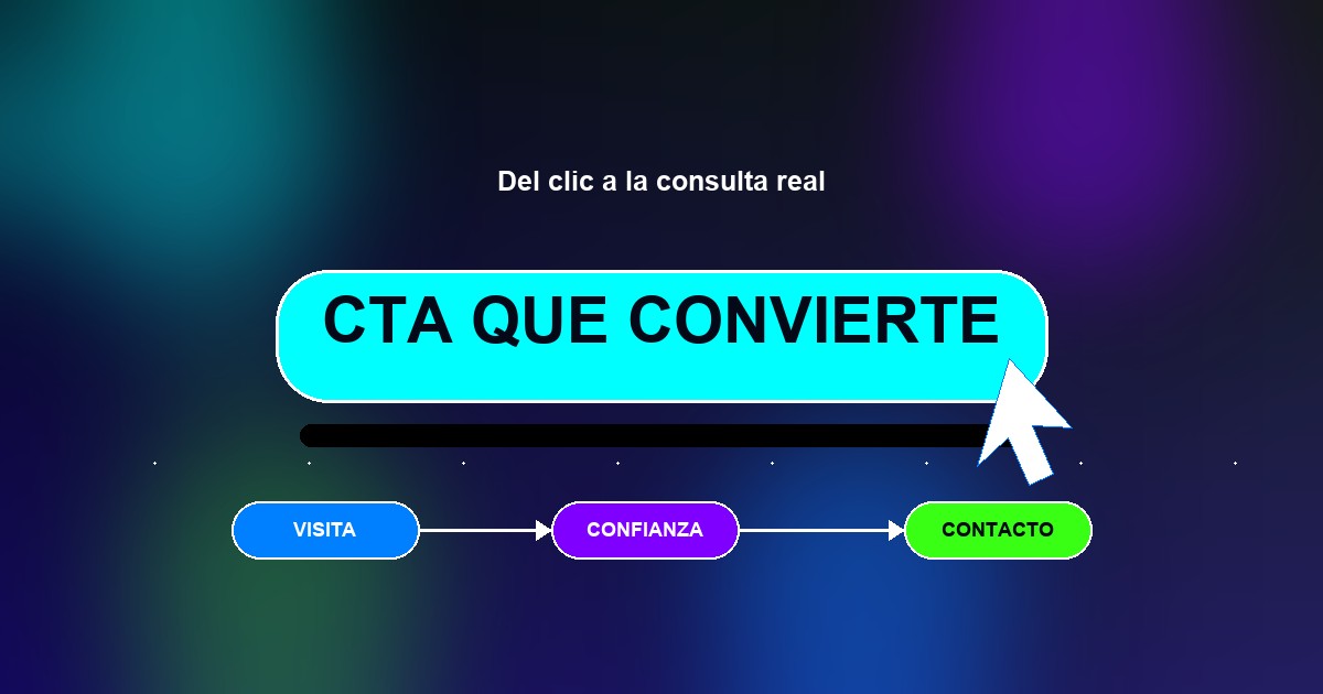
Website calls to action: how to turn visits into inquiries
June 23, 2026 · 8 min read
A website should not simply “be online”. If someone lands on it, understands what you offer and trusts your business, the next step has to be obvious. That step is called a call to action, or CTA.
It can be a WhatsApp button, a quote request, a booking, a purchase, a download or a form. The point is not to make the button large for the sake of it. The point is to answer one simple question: “what should I do now?”.
A good CTA reduces hesitation
Many websites lose inquiries because they leave the visitor thinking. The copy may be good, the images may look professional and the service may be explained, but there is no clear path forward. When someone has to look for the button, compare confusing options or guess what happens next, the conversion cools down.
An effective CTA does not push: it guides. It tells the visitor what the reasonable next step is and gives confidence about what will happen after clicking.
“The best call to action does not shout louder: it appears exactly when the visitor has understood the value.”
What a button should say
Avoid generic button text such as “Submit”, “More information” or “Click here” when the context is not enough. Concrete actions work better:
“Request a quote” when the visitor is considering hiring you.
“Ask on WhatsApp” when the sale starts with a conversation.
“Book a call” when you need to qualify the project.
“See plans” when the decision depends on comparing options.
“Buy now” when the purchase can happen without an intermediary.
Practical rule: the button text should anticipate the result, not describe the gesture. Nobody wants to “click”; they want to solve something.
Where to place calls to action
The main CTA should appear early, usually in the hero or first screen, but it should not be the only one. A good page repeats the action at strategic moments: after explaining the service, after showing benefits, after answering objections and near the end.
Repetition is not a problem when it is integrated well. The problem is repeating ten different buttons that compete with each other. If the main goal is to receive WhatsApp inquiries, the whole journey should lead toward that action.
One primary CTA and secondary actions
Not every visitor is ready to buy or inquire in the first minute. That is why it helps to separate the primary action from secondary actions. The primary action has more visual weight. Secondary actions support the decision without stealing attention.
For example: “Request a quote” can be the primary button, while “See our work” supports visitors who still need more trust. This connects directly with the structure of an effective website.
Visual design: visible, not annoying
The main button needs contrast, space around it and a comfortable size on mobile. If everything on the screen competes with the same color, nothing stands out. If the button looks like decoration, it gets missed. And if it takes over the screen or appears as an invasive popup, it creates resistance.
A good CTA is recognized in less than a second. It has enough breathing room, clear contrast against the background and a position that follows the natural reading flow.
The promise around the button
Sometimes the issue is not the button, but the content around it. Before asking for action, the page has to make clear what you offer, who it is for, why it matters and what happens next. An isolated button does not convert if the value proposition has not landed.
Small support lines help a lot: “We reply within the day”, “No commitment”, “We guide you before quoting” or “We coordinate through WhatsApp”. These simple details reduce friction.
How to know if it works
To know whether a CTA works, it is not enough to decide if it “looks nice”. You need to observe how many people reach the page, how many click and how many real inquiries arrive. If there is traffic but few clicks, visibility may be the issue. If there are clicks but few inquiries, the promise or channel may need work.
Conversion improves through small adjustments: changing the text, moving the button, simplifying the form, adding proof or clarifying the next step.
Do you want to check whether your website is losing inquiries because the next step is unclear?