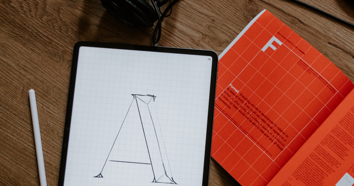
Fonts are the visual voice of your brand. A well-chosen font communicates professionalism before the user reads a single word. A poorly chosen font can make a technologically impeccable site look amateurish. However, web typography is one of the most underrated elements in site design for Uruguayan businesses.
What is a web typography?
A web font (also called a web font) is a typeface optimized for rendering on digital screens. Unlike system fonts (those installed on your computer), web fonts are loaded from a server or a service like Google Fonts, ensuring that all users see the exact same typographic style, regardless of their device or operating system.
Types of fonts and what they communicate
→
Sans-serif (without serifs): modern, clean, digital, direct. Examples: Montserrat, Inter, Roboto, Open Sans. Perfect for startups, tech, professional services, corporate websites.
→
Serif (with serifs): classic, traditional, reliable, editorial. Examples: Georgia, Merriweather, Playfair Display. Ideal for media, lawyers, publishing, established brands.
→
Display: expressive, striking, unique. It is used only in large titles, never in long texts. Communicate creativity and distinction.
→
Monospace: technique, code, developer. Examples: Fira Code, JetBrains Mono. Used on technology sites to give a feeling of technical precision.
"The correct typography makes your brand speak without words. The wrong one makes the user feel something bad without being able to explain what."
The two sources rule
Most well-designed websites use exactly two fonts: one for titles (which can be more expressive or personalized) and another for body text (which prioritizes readability). More than two fonts on a website creates visual inconsistency. Less than two can be monotonous. The most effective combination is usually a sans-serif font for both functions, with different weights (bold for titles, regular for body).
Google Fonts: the free web font library
Google Fonts offers more than 1,400 font families that are free to use and open source. It is the most used solution in the world for websites of all types. Best Google Fonts for Business in 2026:
→
Inter: the source of the moment in UI/UX design. Extremely readable, modern and versatile.
→
Montserrat: geometric, modern, with character. Very popular in Uruguay and Latin America.
→
Roboto: the source of Android. Very readable at any size.
→
Playfair Display: elegant serif for premium brands or luxury services.
→
Poppins: friendly, round, modern. Excellent for services to the final consumer.
Size and spacing: what no one tells you
The minimum font size for body text on mobile is 16px. Any smaller size forces the user to zoom in, which destroys the experience. The optimal line-height for comfortable reading is between 1.5 and 1.8 times the font size. And the width of the text lines should not exceed 70-75 characters: very wide texts tire the eyes and reduce comprehension.
Do you want to see how the fonts complement the correct colors?